Softography
Released games that I've worked on over the past six years
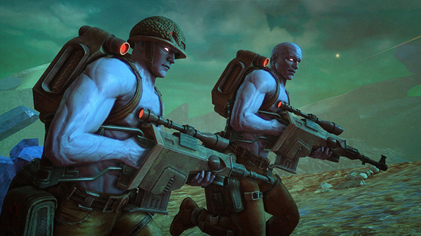
Rogue Trooper Redux
October 2017
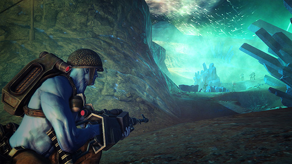
Rogue Trooper Redux
October 2017
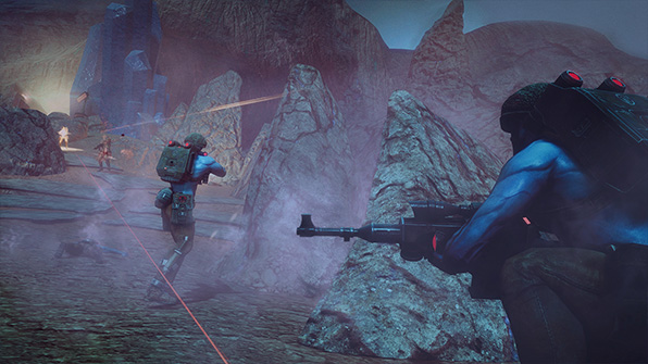
Rogue Trooper Redux
October 2017
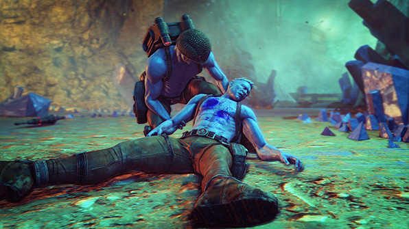
Rogue Trooper Redux
October 2017
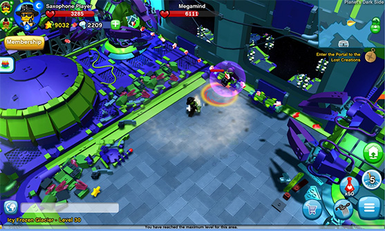
LEGO Minifigures Online
September 2015
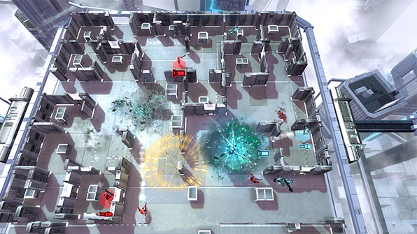
Frozen Synapse Prime
August 2015
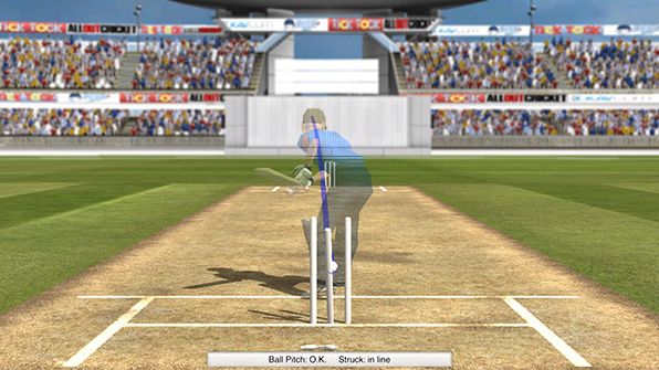
Cricket Captain 2015
August 2015
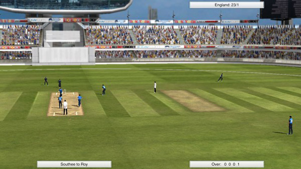
Cricket Captain 2015
June 2015
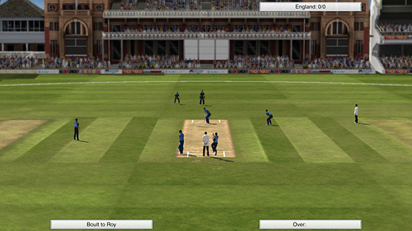
Cricket Captain 2015
June 2015
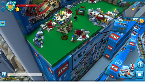
LEGO Minifigures Online
June 2015
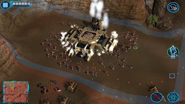
Z Steel Soldiers
April 2015
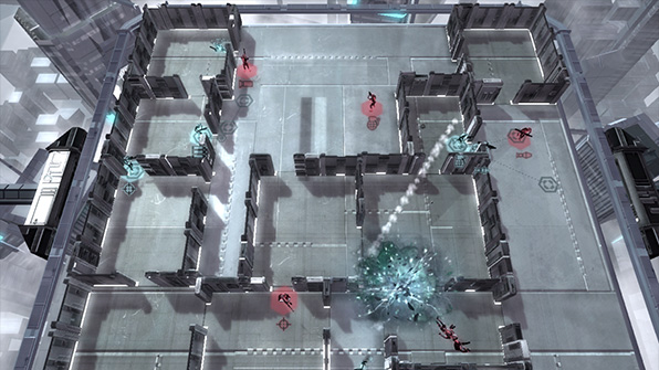
Frozen Synapse Prime
March 2015
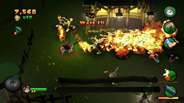
Burn Zombie Burn
December 2014
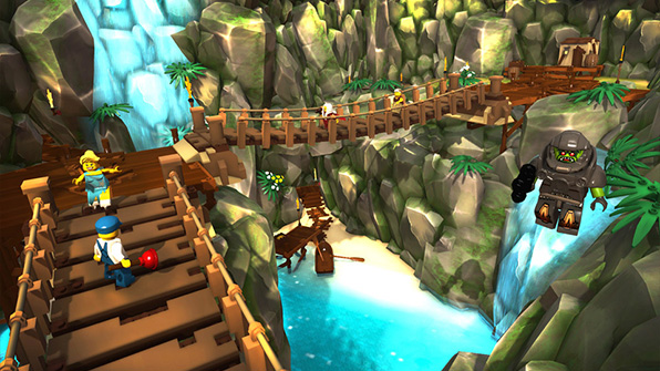
LEGO Minifigures Online
December 2014
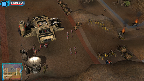
Z Steel Soldiers
August 2014
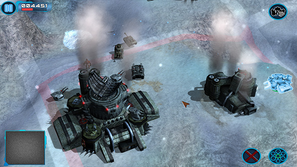
Z Steel Soldiers
August 2014
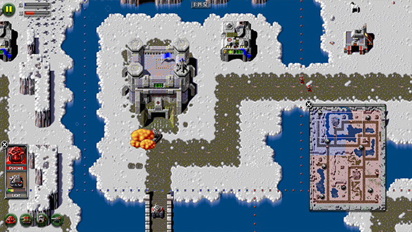
Z
July 2014
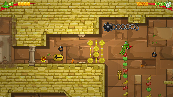
Superfrog HD
June 2014
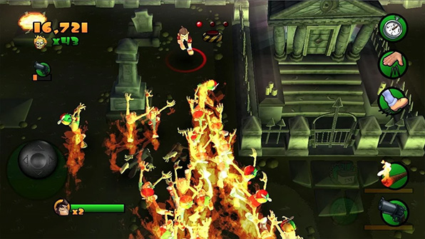
Burn Zombie Burn
May 2013
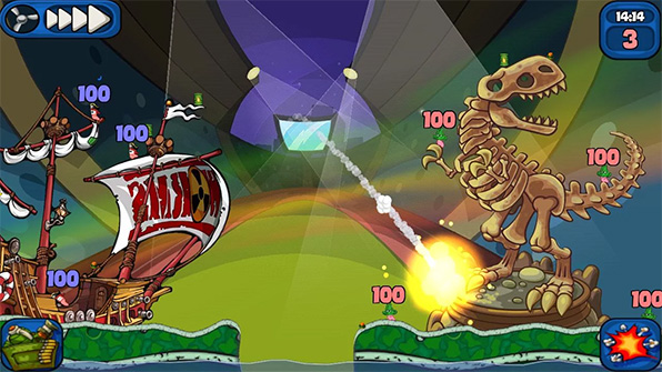
Worms 2: Armageddon
April 2013
I'm a professional game developer from Wakefield, England, working as a senior programmer for Rebellion North.
I'm a married father of five and I a also sometimes do Retroburn stuff.
Tags
2013 3d alphalabs amazon apple archivirtual asynchronous battlefield bad company 2 ben 10 bepu beta blackmagic design blog blue marble bootcamp borderlands bsp calibration charity charvel childsplay comments competition content tracker counter-strike crash csgo css3 cycling dear esther deferred deus ex develop conference direct x discipline documentation doom 3 bfg dpi dr bott eidos elite force email deliverability eurogamer expo facebook focus fresnel game development game horizon game republic gamedev games gaming geoip girls make games global offensive grid guitar half-life 2 hawken hd7 hobbyist htc humble indie bundle imac indie indie trials indietrials intensity pro ip-countryside iron man 3 jamulus rift jquery kids kinect launch conference left 4 dead live lost mac mac osx manchester manhacks mass effect 2 matrox maya minecraft mirrors edge montreal morrowind movies museum of the microstar music mxo2 mini mysql nausea network networking nokia normal mapping obj oculus rift omnitrix ouya pedal for pounds php physics playstation suite port25 portal portal 2 positron posters powermta project aedra project euler promotion properties proton pulse ps vita ps4 psn racer reddit rendering retroburn game studios reviews rift racer riftracer roadkill roller coaster sdl2 shadow racers sharks shoct skyrifters snds space cadet spam trap star trek steam stencyl storage super stock sd1 fr superhot team fortress 2 tesselating tesselation texture editor thunderbird thunderclap ticktock games tiga track builder track bulder trials tv twitter uk ultimatrix usergroup vequencer video vireio visual assist visual studio vorpx voucher vr vr cinema war thunder warren web willow windows 8 windows 8.1 windows phone 7 workbench wp7 wp7dev xbla xblig xblig network xbox xbox live indie games xna xnaukug xperia play zombies on the holodeck
Archive
November 2025 (2)
August 2018 (1)
March 2016 (1)
February 2016 (1)
November 2015 (1)
March 2015 (1)
February 2015 (2)
January 2014 (2)
June 2013 (4)
May 2013 (22)
February 2013 (1)
January 2013 (2)
July 2012 (1)
June 2012 (1)
March 2012 (1)
January 2012 (4)
December 2011 (1)
November 2011 (1)
October 2011 (2)
September 2011 (3)
July 2011 (1)
June 2011 (3)
April 2011 (2)
March 2011 (8)
February 2011 (3)
January 2011 (2)
December 2010 (4)
November 2010 (1)
August 2010 (2)
July 2010 (5)
June 2010 (6)
May 2010 (18)
April 2010 (4)
Links
Web
XNA
Aaron Stebner
Allen Pestaluky
Catalin Zima
George Clingerman
Jim Perry
Matt Pettineo
Michael Klucher
Nick Gravelyn
Petri Wilhelmsen
Popescu Alexandru-Cristian
Riemer Grootjans
Roy Triesscheijn
Sgt. Conker
Shawn Hargreaves
Tom Looman
XNA Content Tracker
XNA UK User Group
Allen Pestaluky
Catalin Zima
George Clingerman
Jim Perry
Matt Pettineo
Michael Klucher
Nick Gravelyn
Petri Wilhelmsen
Popescu Alexandru-Cristian
Riemer Grootjans
Roy Triesscheijn
Sgt. Conker
Shawn Hargreaves
Tom Looman
XNA Content Tracker
XNA UK User Group
Games
Email Deliverability
Wednesday, March 2nd 2011 / Web
Getting Eidos Montreal to fix their website
One of the most memorable games I've ever played was Deus Ex, developed by Ion Storm and released in 2000 at a time when I was pretty new to PC gaming.
I have played it a few times through and one of the coolest aspects of the game was how you could play it in multiple ways.. you could kill enemies, tranquillise them or simply sneak by many of them and avoid detection. It had a decent story too but it was the gameplay that made it such a great game and is still to this day one of my favourite games.
Deus Ex: Human Revolution has been in development for some years, it's the third in the series (after a decent sequel that wasn't as immersive as the original) and Eidos (who also published the earlier games in the series) will soon be releasing it. The game looks very cool and is definitely on my list to buy this year (probably for 360) and Eidos Montreal recently launched a new site dedicated to the game and also updated their own site with a new look to go along with it.
Soon after the new site launched I noticed a few things wrong with the site and sent some messages to Eidos people on Twitter. One thing I mentioned has been fixed (a French image was shown on the English site) but a few other things I mentioned are still the same. So I decided I'd email them but with no particular email address to send it to I just CCd in a few and sent the following email in the hope that they take notice and attempt to fix their site:
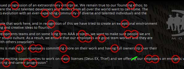
To me, as a professional web developer I'm amazed that a company like Eidos have not tested their site in every way possible before launching it. Hopefully they'll pass on my notes to the people in charge of the site's development and I'll update this post if I hear anything back from them or notice they've fixed the issues. Below are the images I attached to the email to show them the main problem of the container width and the missing pixels on under-the-line characters:


I know to some people this will seem irrelevant but I really do think these are important issues that Eidos Montreal should fix. I have to admit I do notice problems like this on websites for major companies quite often and unfortunately it takes a while for some of these companies to do anything about it.
I have played it a few times through and one of the coolest aspects of the game was how you could play it in multiple ways.. you could kill enemies, tranquillise them or simply sneak by many of them and avoid detection. It had a decent story too but it was the gameplay that made it such a great game and is still to this day one of my favourite games.
Deus Ex: Human Revolution has been in development for some years, it's the third in the series (after a decent sequel that wasn't as immersive as the original) and Eidos (who also published the earlier games in the series) will soon be releasing it. The game looks very cool and is definitely on my list to buy this year (probably for 360) and Eidos Montreal recently launched a new site dedicated to the game and also updated their own site with a new look to go along with it.
Soon after the new site launched I noticed a few things wrong with the site and sent some messages to Eidos people on Twitter. One thing I mentioned has been fixed (a French image was shown on the English site) but a few other things I mentioned are still the same. So I decided I'd email them but with no particular email address to send it to I just CCd in a few and sent the following email in the hope that they take notice and attempt to fix their site:
Subject: Problem with website's design
To: marketingpr@eidosmontreal.com
Cc: webmaster@eidosmontreal.com (bounced, no such address)
Cc: info@eidosmontreal.com
Hi,
Just wanted to report an issue with the site's design. I sent a message on twitter but got no response so wasn't sure if it has been passed on.
Basically the issue is that the site is clearly designed to accomodate for users with 1024x768 monitors (since it's less than a thousand pixels wide), but the site doesn't auto position itself at that screen resolution. This is because the entire site is wrapped in a 1280 pixel wide container. Technically that means it doesn't even center itself in 1280 as it doesn't take the vertical scrollbar in to account. If viewed at 1024x768 you get a large empty bar down the left and the rest of the site is cut off on the right side of the screen.
It's clear to see from the site's CSS where the width is being applied to this container div and should be an easy fix. I've attached screenshots of how the site looks in 1280x1024 and 1024x768 so you can see the problem. I might also mention that this makes the site render incorrectly in mobile devices (I tried an iPod, WP7 and Blackberry). In some it has large blank spaces down the sides of the site (as it thinks the 1280 container should be displayed on screen) and on some it just renders partially off-screen as it does on a PC in 1024x768).
I'm a professional web developer myself and I specifically take pride in developing sites that are usable and accessible for as many users as possible. I have to say that I love the new site and it looks very flashy but this problem must be affecting many of your visitors who use lower resolutions and mobile devices.
I also tweeted about another minor issue which just makes the site look unprofessional; the line-height or margins seem to have been altered on all the body text to push the lines of text closer together, however this has cut off the bottom row of pixels from characters such as g, y and q. I've attached a screenshot of that too (and just noticed a spelling/grammar mistake on the 'Our Studio' page).
I'm happy to say that one of my suggestions was fixed, I noticed the English version of the site had a French twitter button shortly after it went live but that was quickly sorted out.
I hope you can pass this on to whoever is responsible for managing the website so they can make the quick easy fixes for the problems I've pointed out.
Best regards,
Martin
To me, as a professional web developer I'm amazed that a company like Eidos have not tested their site in every way possible before launching it. Hopefully they'll pass on my notes to the people in charge of the site's development and I'll update this post if I hear anything back from them or notice they've fixed the issues. Below are the images I attached to the email to show them the main problem of the container width and the missing pixels on under-the-line characters:


I know to some people this will seem irrelevant but I really do think these are important issues that Eidos Montreal should fix. I have to admit I do notice problems like this on websites for major companies quite often and unfortunately it takes a while for some of these companies to do anything about it.
0

